Alner
From Koinpack to Alner
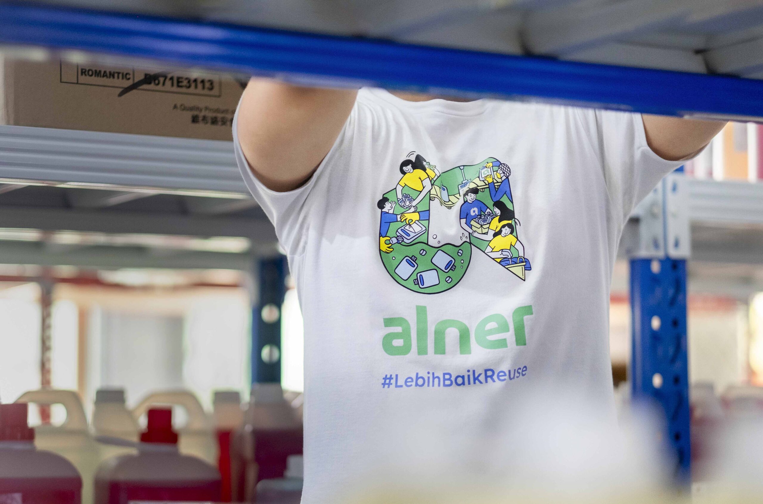
Alner is Indonesia’s first sustainable packaging brand, leading the transition from single-use to returnable and reusable solutions. Collaborating with one of the most renowned FMCG companies, Alner offers a range of innovative systems like Reverse Vending Machines, promoting responsible waste habits. Their commitment to hygiene, customer engagement through customer engagement programs, and a focus on a circular economy make Alner a trailblazer in reducing plastic waste and fostering sustainability in Indonesia.
Scope of work
Brand Strategy, Brand Naming, Brand Identity, Packaging Design
Credits
Researcher: Ludy Imam Magribi. Illustrator: Maryam Nisa. Photographer: Arfat Lodyantra. Motion Designer: Mohammad Heikal
Brand Identity, Brand Naming, Brand Strategy, Packaging Design
OUR ROLE
Alner approached us for a rebranding of their brand name and logo. They believed their previous name, “Koinpack,” did not effectively represent their business. They sought a name that resonated with both local and international audiences while reflecting their core values. Additionally, the previous logo—reminiscent of a coin—was often misinterpreted as representing other industries.
BRAND RESEARCH
To validate their hypothesis and guide the design process, we conducted in-depth brand identity research, utilizing:
- Interviewing BOD (Board of Directors): In-depth interviews with top executives provided insights into the organization’s vision, values, and strategic goals.
- Focus Group Discussions (FGDs) with Users: These structured discussions with users offered qualitative feedback on brand perceptions and experiences.
- Concept Testing: Potential brand ideas were presented to assess their viability and alignment with the target audience’s preferences.

BRAND NAMING
Based on the research findings, the name had to describe the product and its intended outcome effectively. Alner was chosen because it combines “ALternatif” (alternative) and “kontaiNER” (container). “Alternatif” was selected to represent Alner as an alternative to traditional containers. The name Alner is concise and easy to pronounce in English and Indonesian.
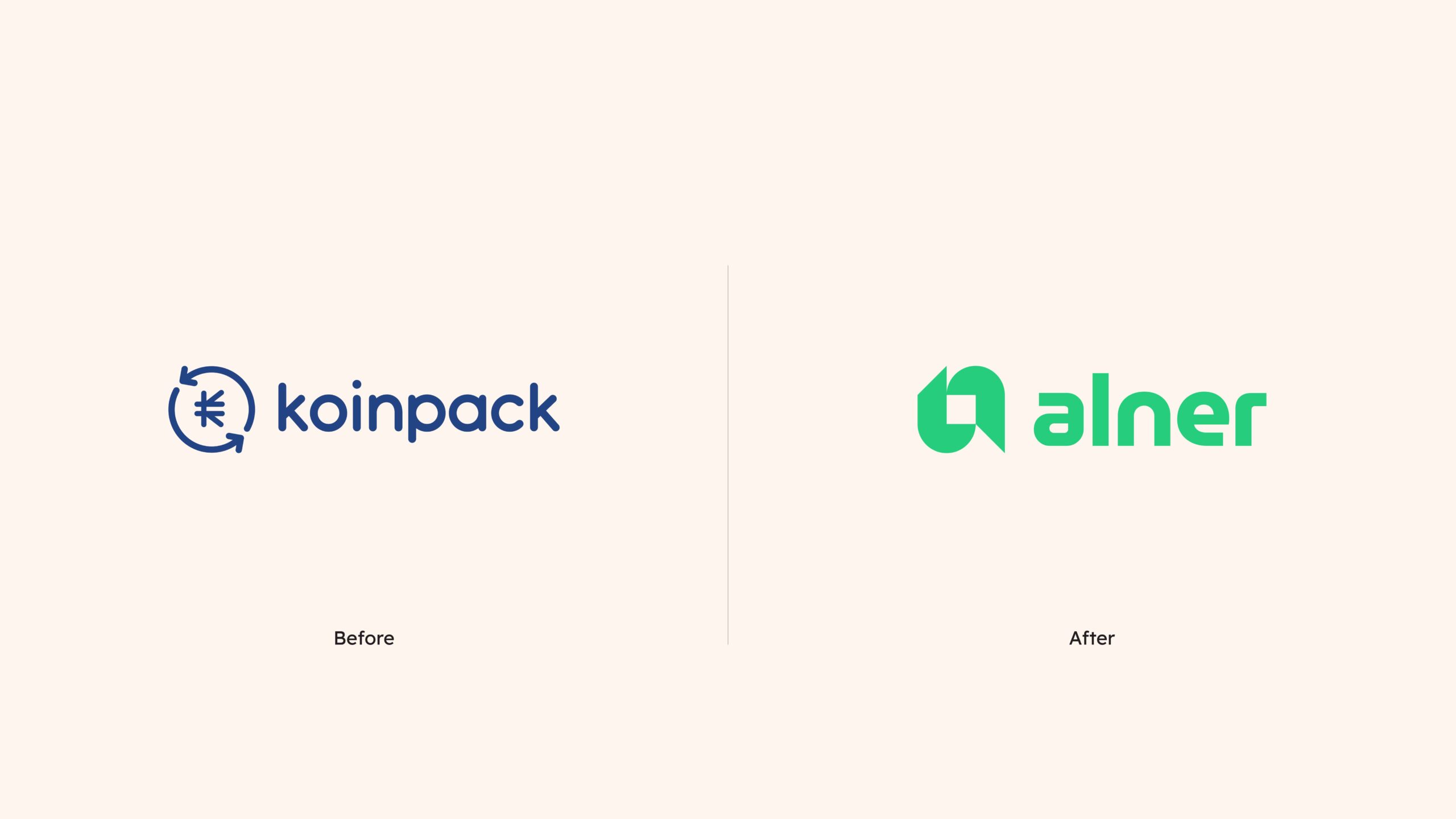
LOGO DESIGN
The new logo, as a whole, embodies the essence of Alner: a forward-thinking, sustainable brand that safeguards its products while creating a two-way exchange of value within a circular economy.

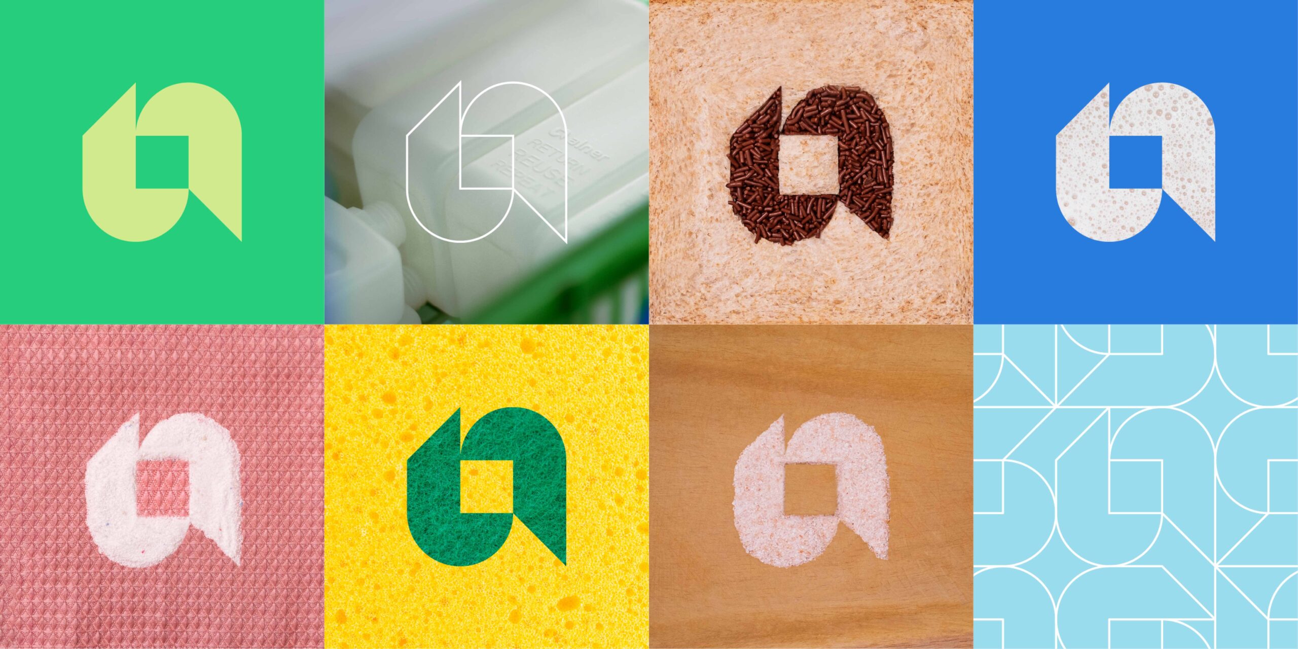
Alner’s visual identity draws inspiration from nature, using a palette of greens and blues to evoke vitality and serenity. Vibrant touches of yellow add energy, connecting the brand to both the organic world and modern aesthetics. This harmonious blend of colors aims to create a visually appealing and engaging brand image that resonates with both contemporary aesthetics and the organic beauty of the natural environment.
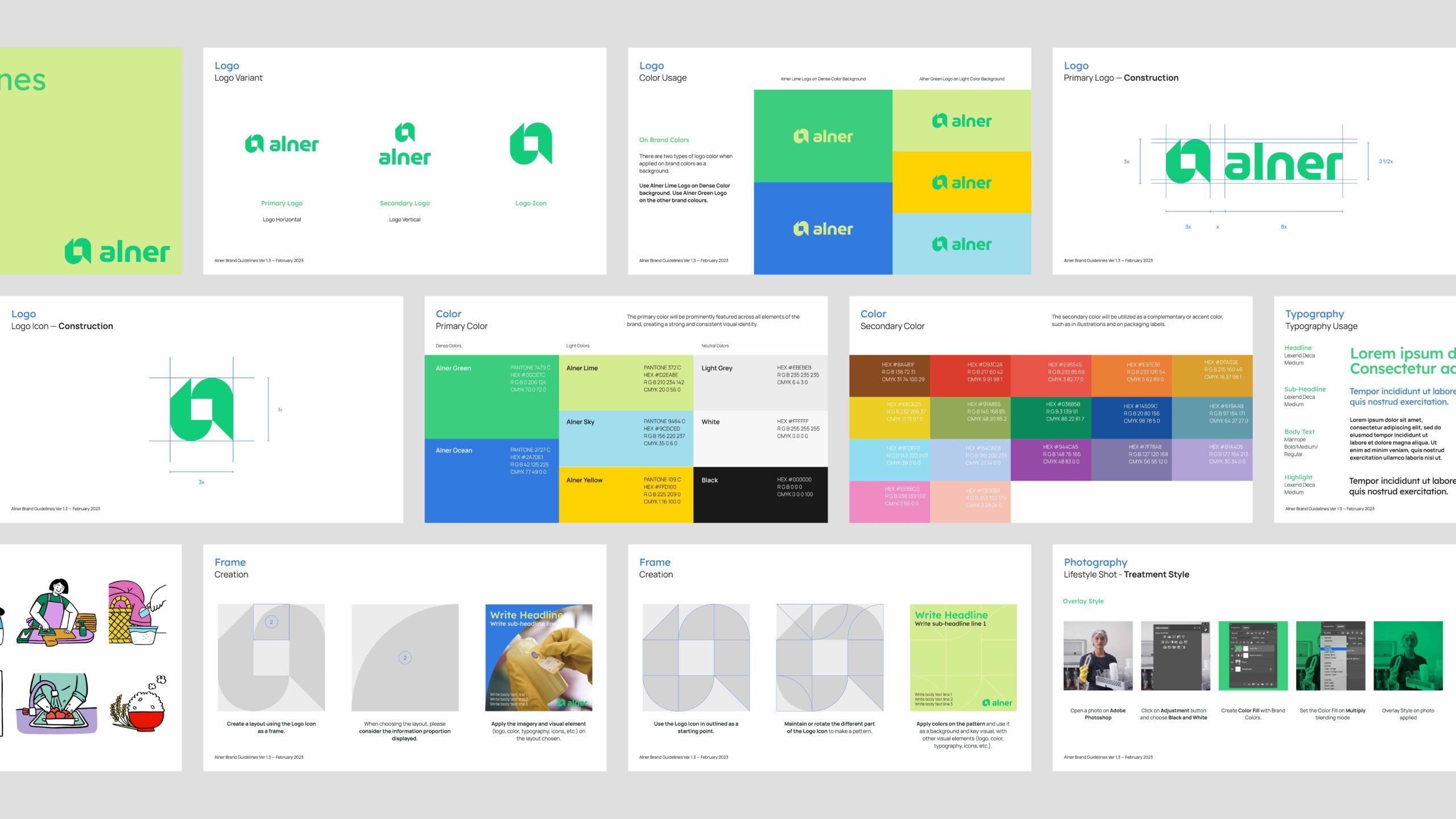
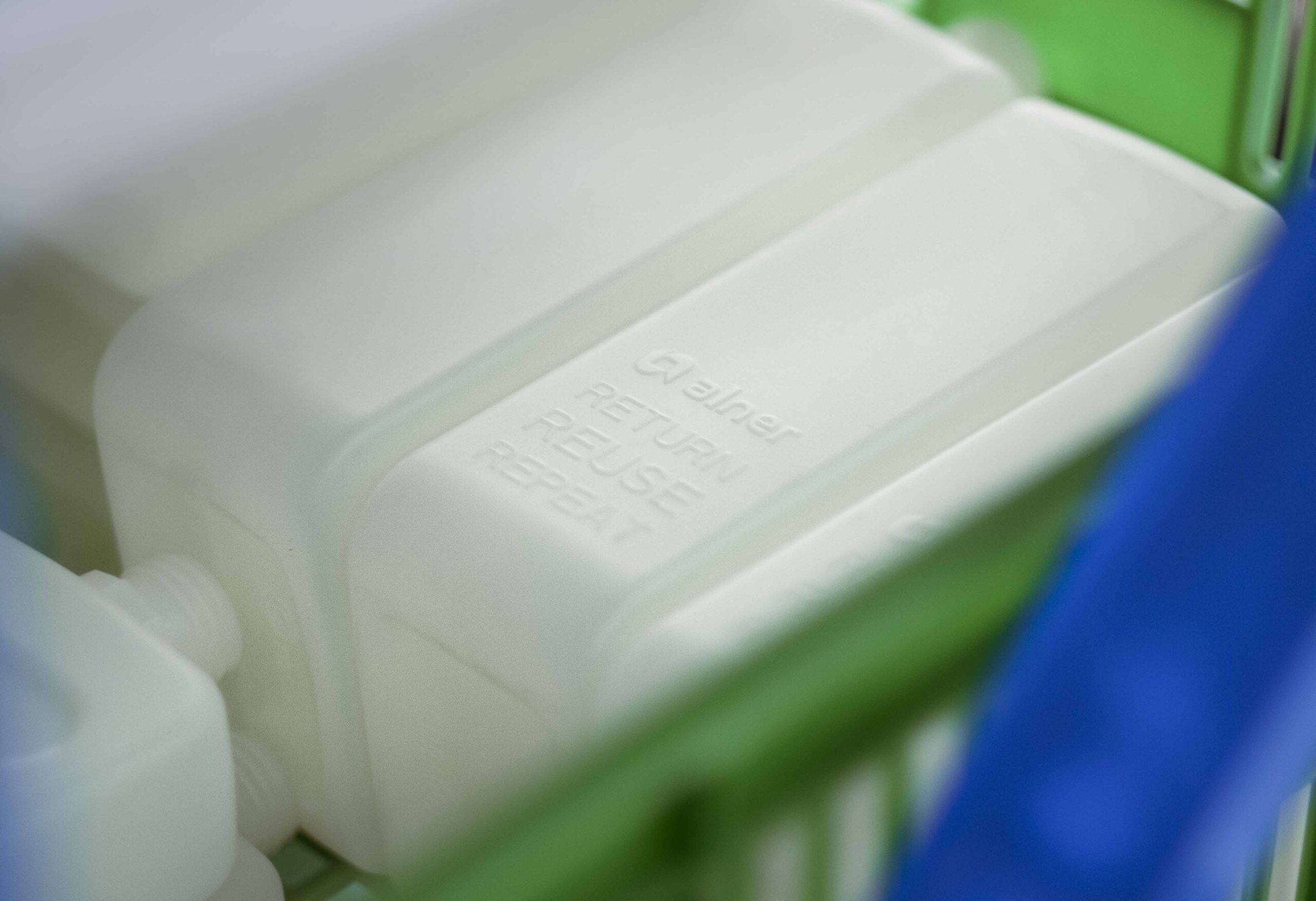
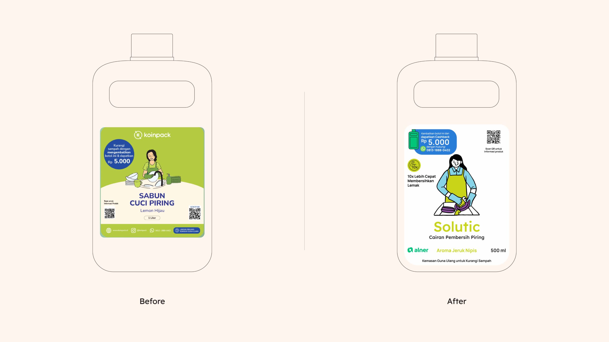
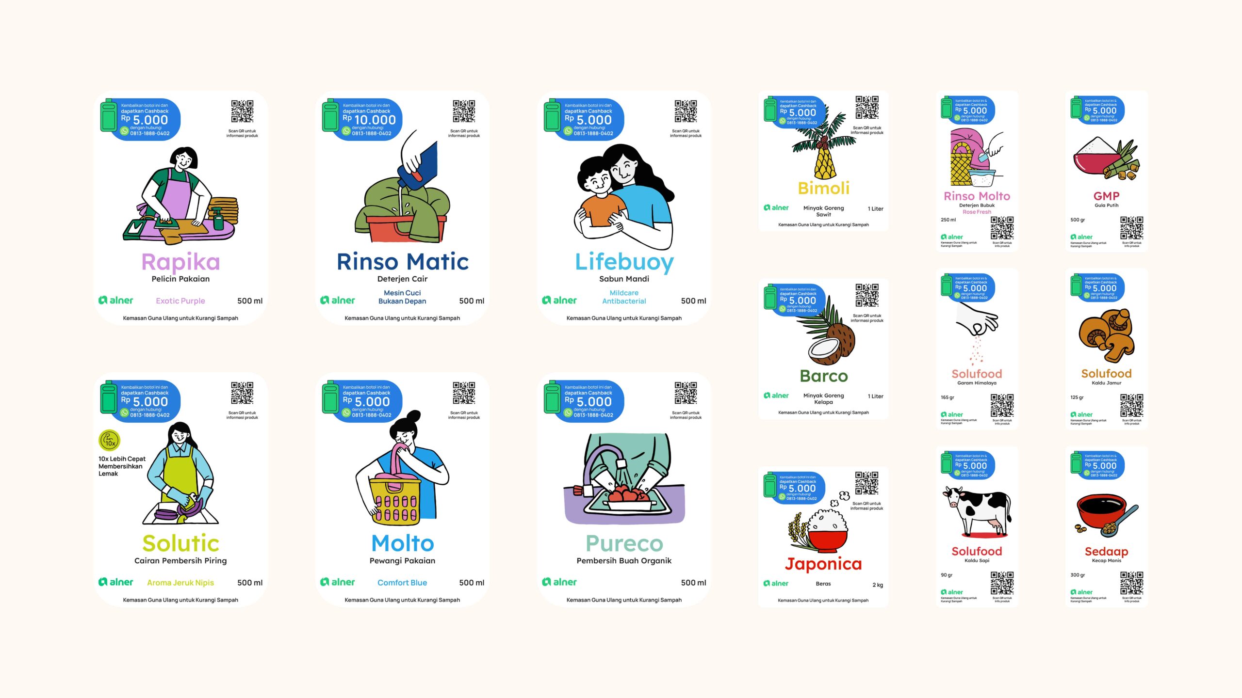
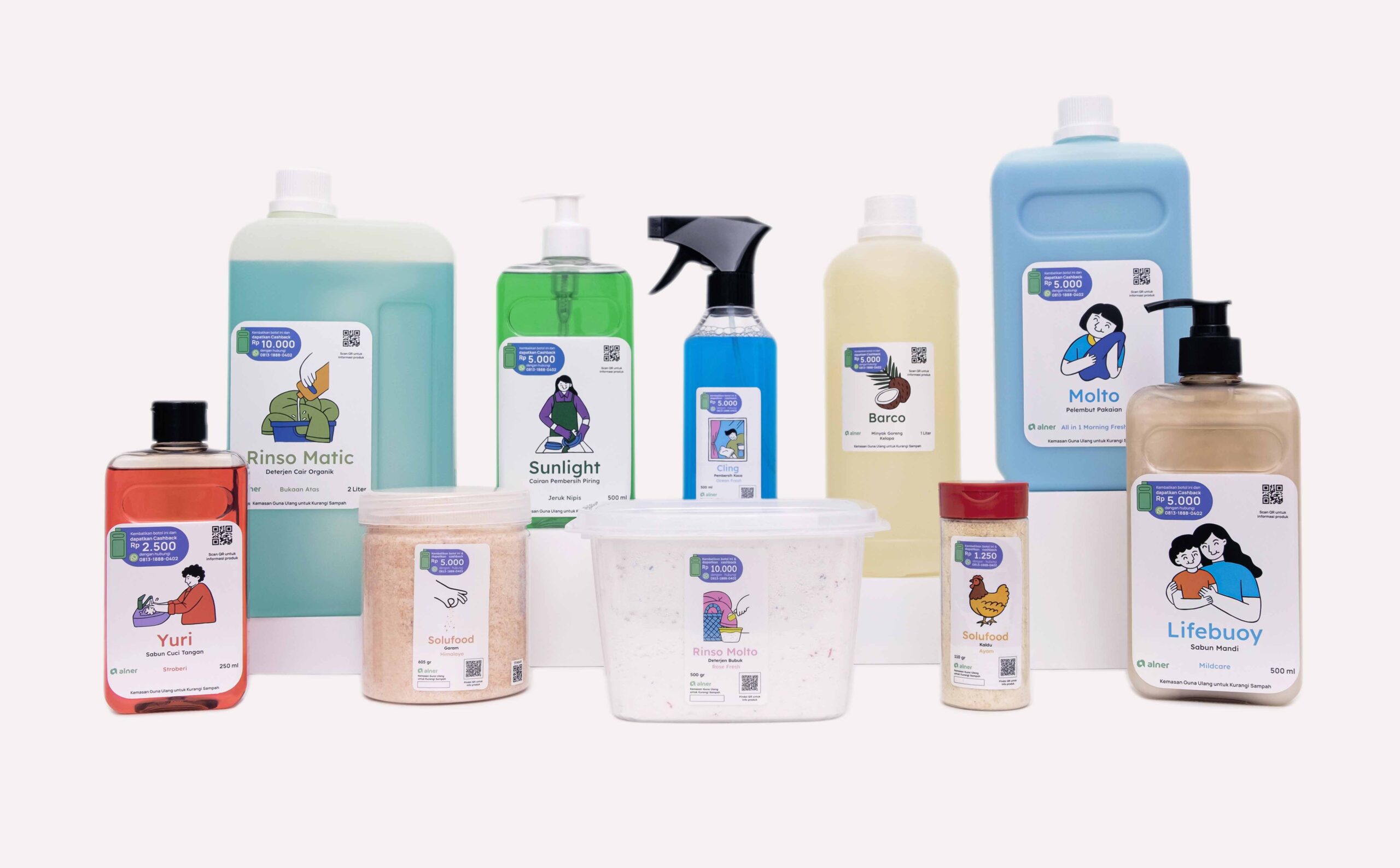
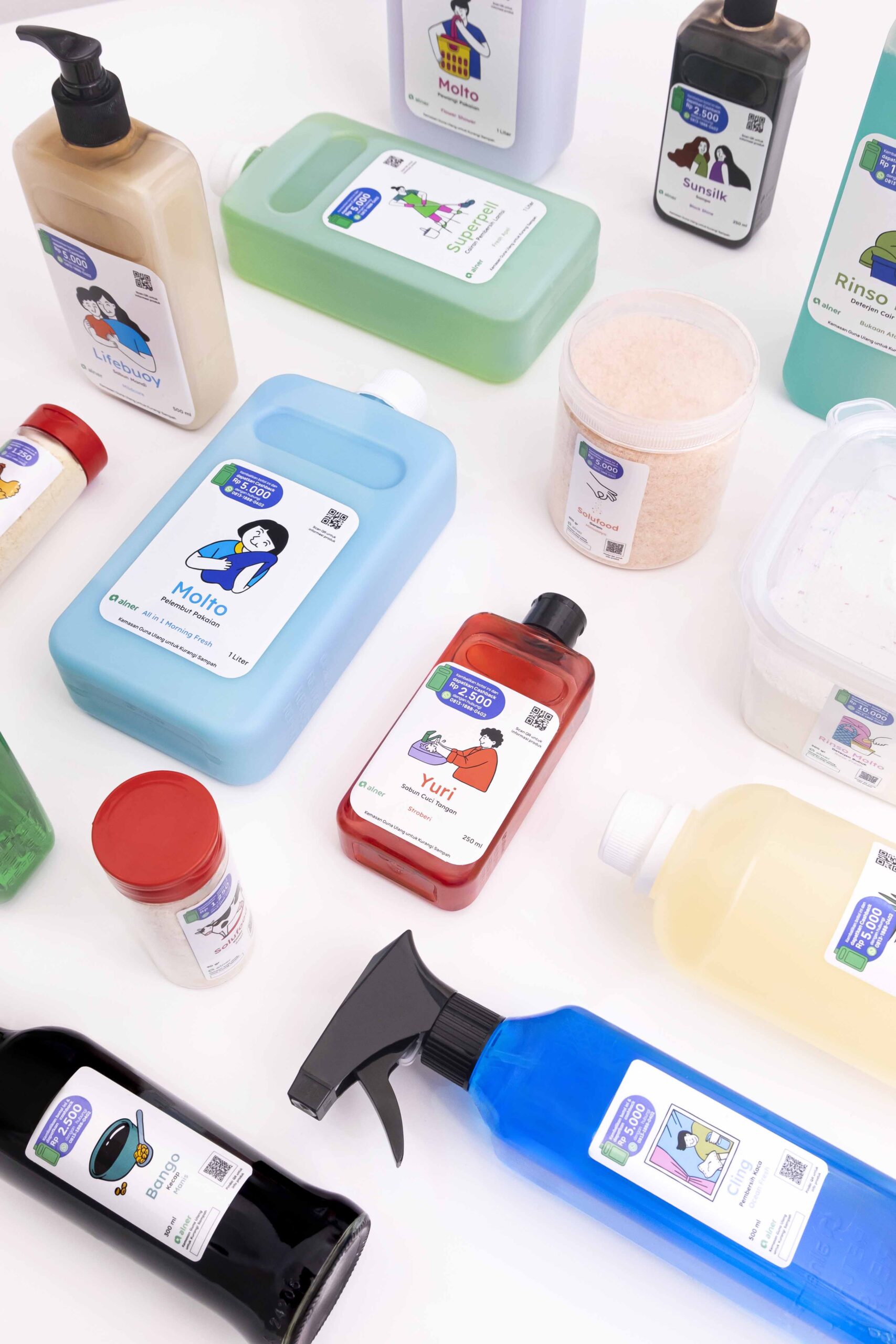
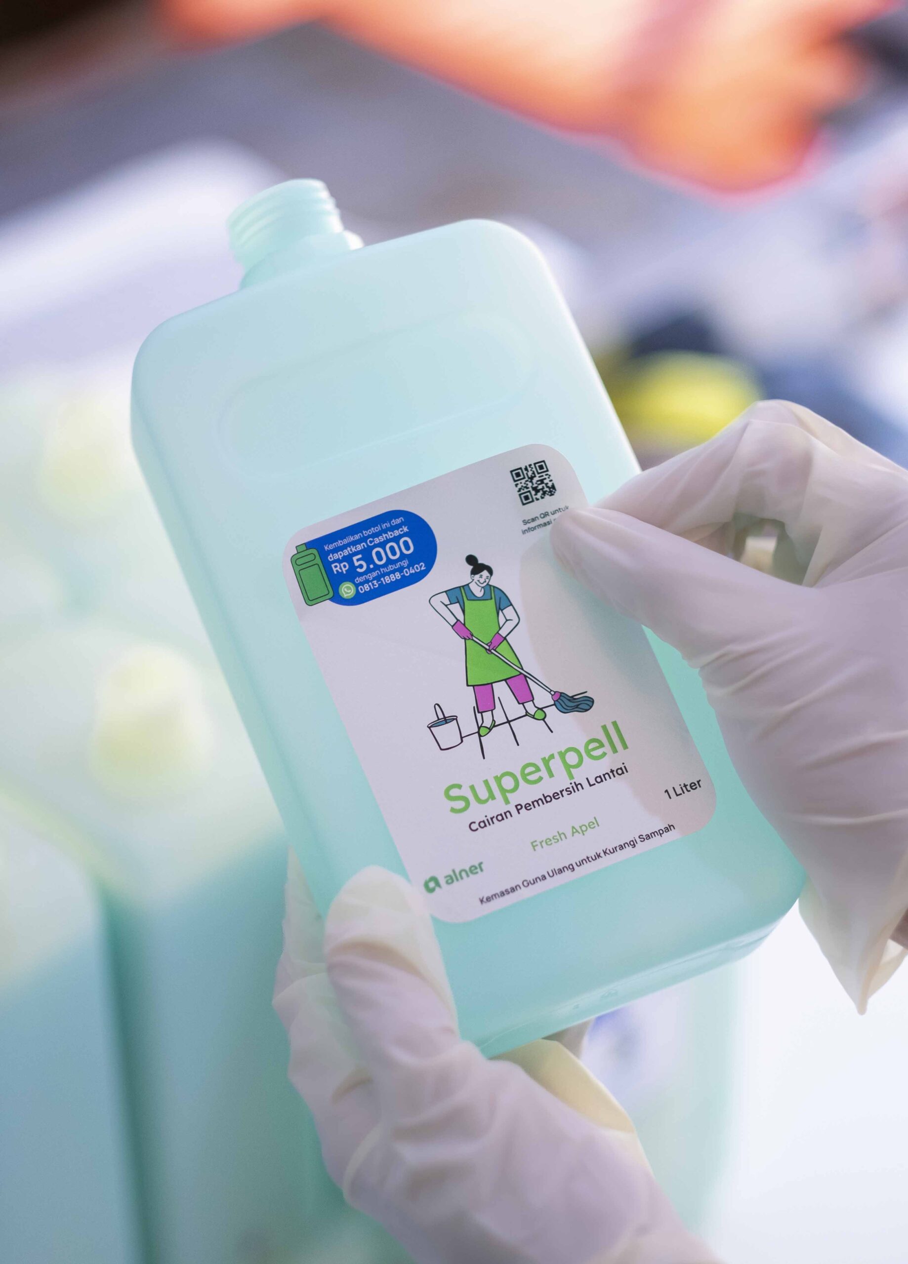
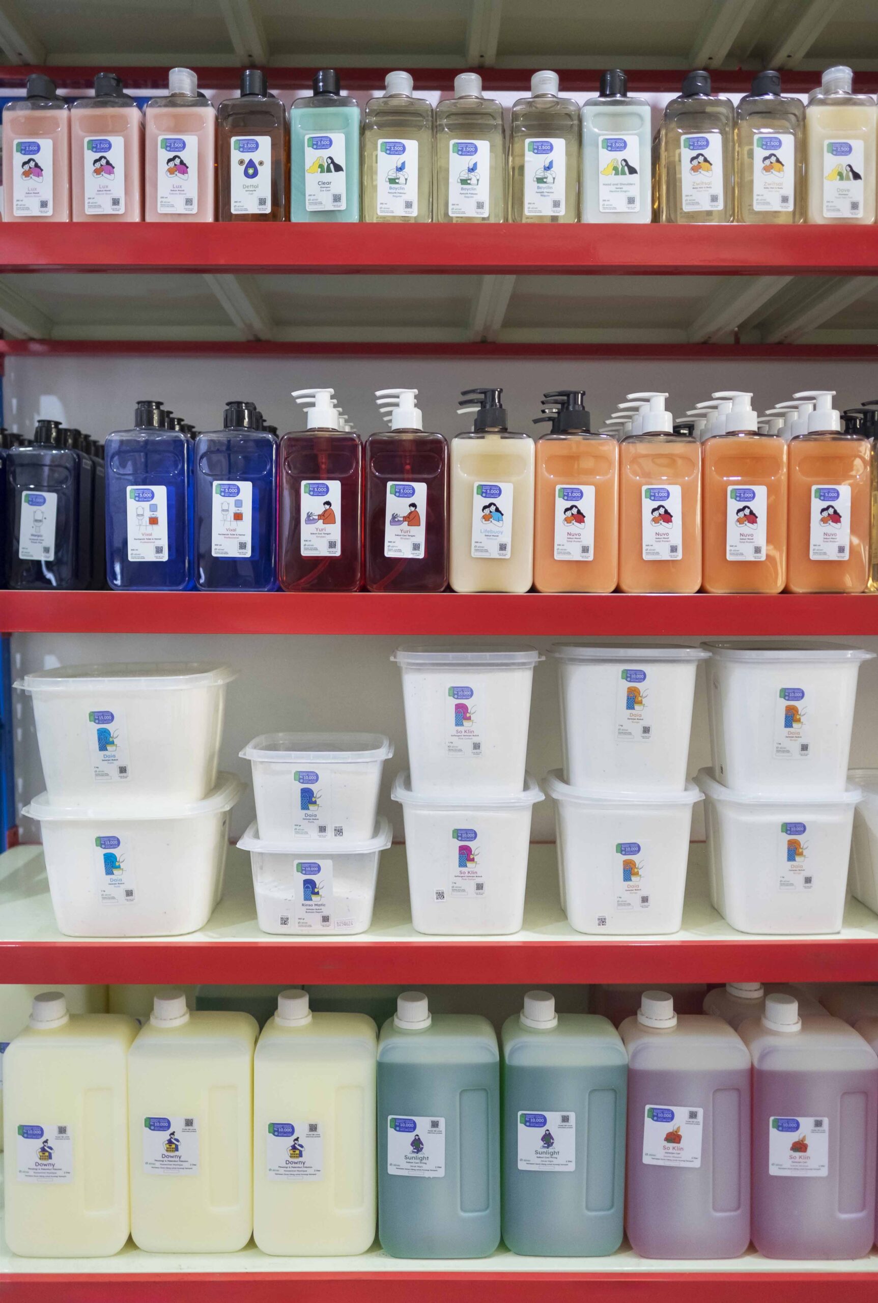
LABEL DESIGN
For packaging design, we focused on establishing a labeling system with a consistent yet flexible approach. Given the diversity of Alner’s products, the labeling system includes graphic elements and signature illustrations tailored to simplify the user’s product selection process. For example, a floor cleaner label features a mopping illustration, while hand soap packaging includes an image of someone washing their hands.
This systematic design ensures clarity for users while supporting Alner’s operational needs, making it easier for staff to manage and maintain consistency across the product range.

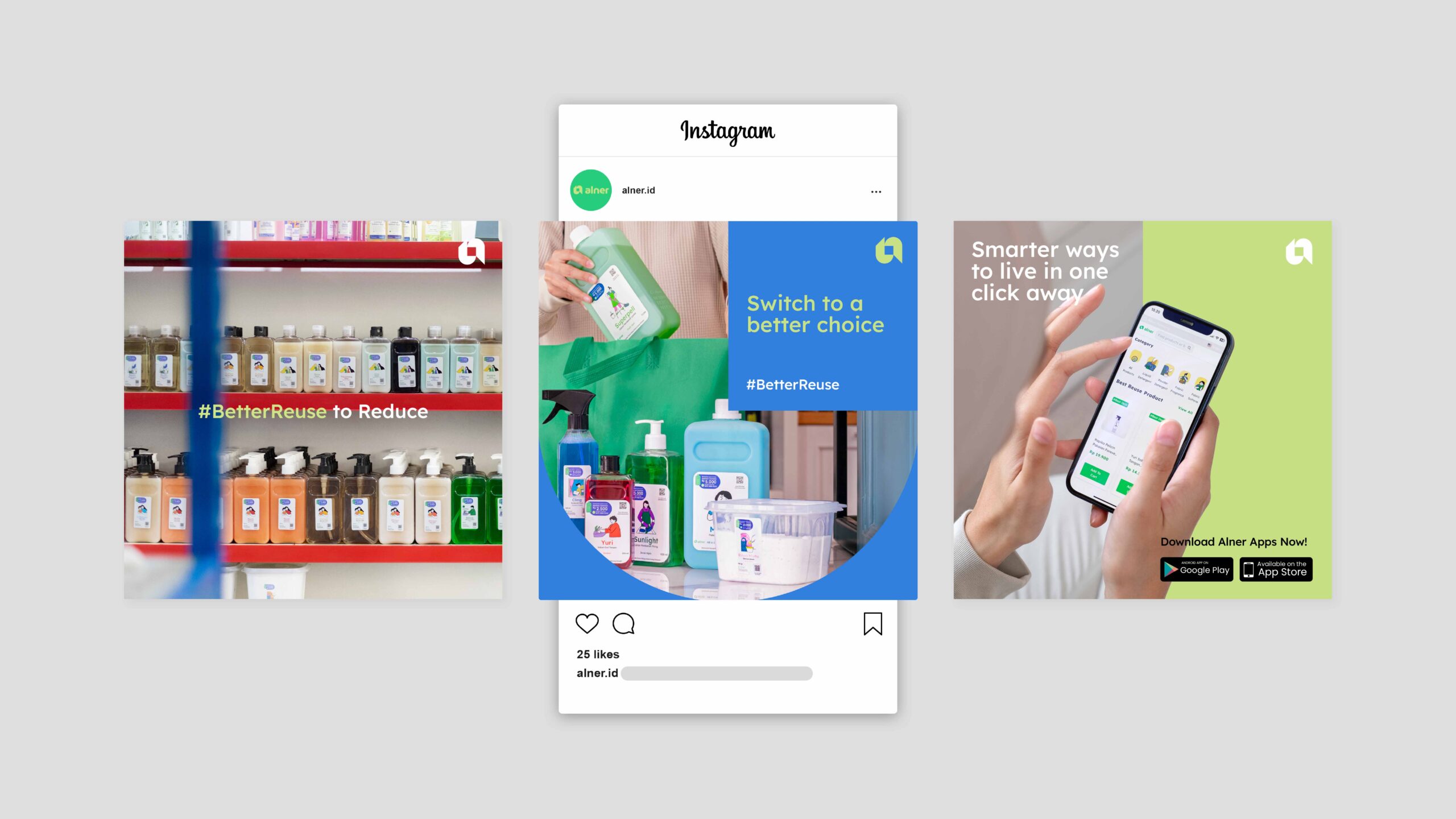
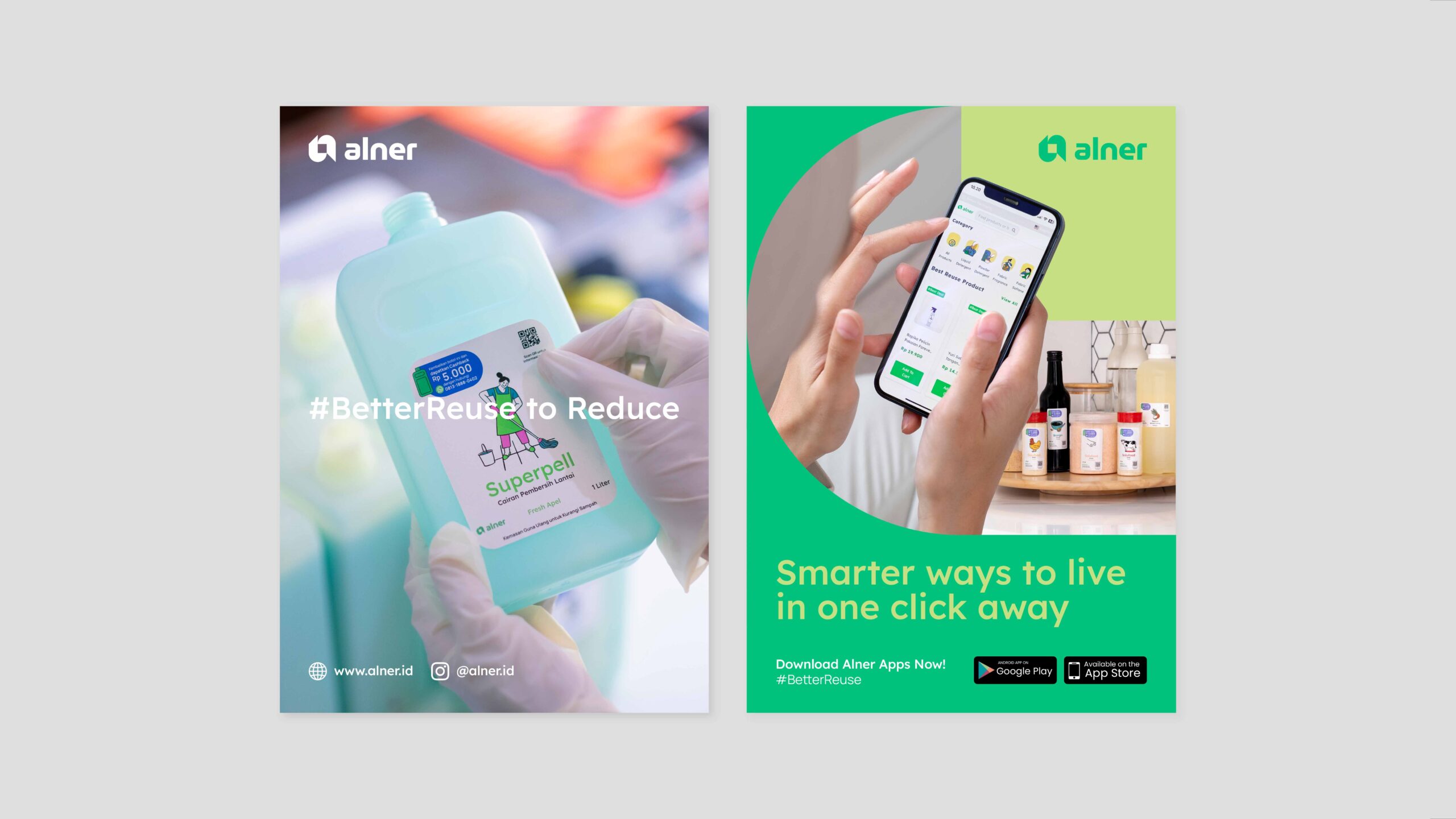
SOCIAL MEDIA
To enhance Alner’s social media management, we provided a comprehensive set of guidelines, ensuring consistency across platforms. These guidelines include:
- Content Pillar.
- The tone of Voice.
- Caption Guide.
- Basic Visual Guidelines, including logo placement and more.
From Koinpack to finally Alner, the new brand guidelines embody Alner’s commitment to leading Indonesia’s transition towards a sustainable circular economy.