Re Store
Shaping Re Store's Brand Identity
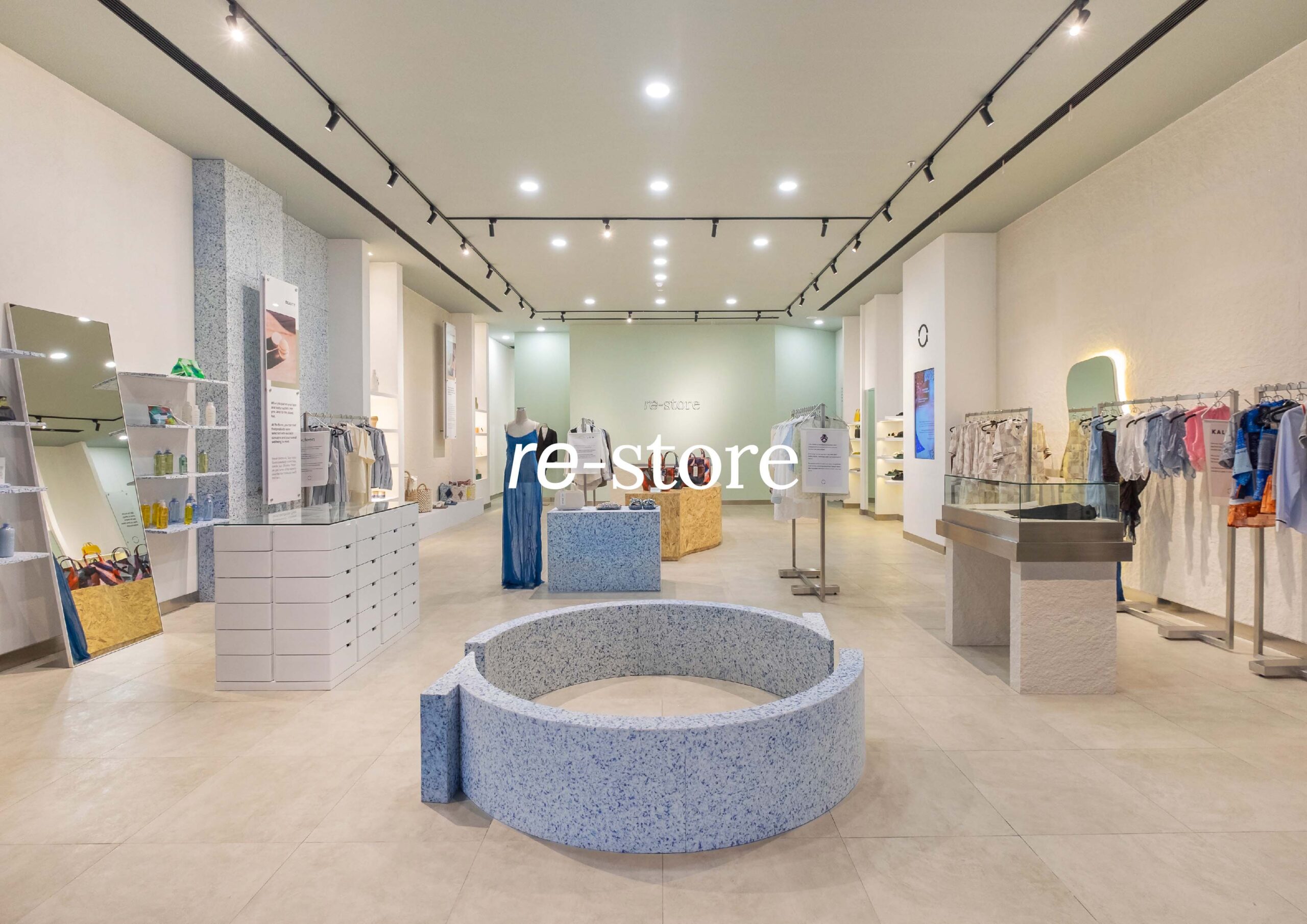
Re Store is a concept store that focuses on responsible consumption and sustainable products. It’s a place where customers can find curated goods that align with our ethos/fundamental pillar. It serves as a hub for responsibly-made products, fostering sustainable consumption by curating a diverse range of goods across fashion and homeware while simultaneously nurturing a supportive community through education, engagement, and events, ultimately embodying a conscious lifestyle made easily accessible.
Scope of work
Brand Strategy, Brand Identity
Credits
Photographer: Arfat Lodyantara
Brand Collaterals and Application, Brand Identity, Brand Strategy

OUR ROLE
With Re Store’s established brand name and visionary outlook, our role encompassed a collaborative partnership to shape their brand identity into a visual masterpiece. Through interviews, brainstorming, and teamwork, we worked side by side with Re Store to bring their vision to life. Acting as an extension of their creative team, we provided the expertise needed to translate their ideas into reality.
BRAND STRATEGY
Before going into the visual aspects, we focused on creating a brand strategy for Re Store. Given its position in a competitive landscape centered on responsible consumption, this step was crucial. Our approach encompassed extensive market and competitor analyses. We conducted in-depth market and competitor analysis to lay a strong foundation, ensuring Re Store’s distinct presence and resonance within the market. This branding strategy became the launchpad for their successful positioning.

LOGO DESIGN
We combined serif and sans-serif typography for the logotype, seamlessly blending modern and traditional elements. The goal is to create a timeless logotype that mirrors the store’s products, which are intended to be enduring and ageless. This fusion of fonts captures a harmonious balance between contemporary and classic aesthetics, ensuring that the logotype remains relevant and representative of the store’s products well into the future.

The logogram concept involves a counter-clockwise cycle (representing sustainability) designed to go against the conventional clockwise direction. This choice is symbolic of the reusing aspect (as opposed to producing), aligning with the core concept of promoting responsible consumption and recycling.


COLORS
The muted color palette, encompassing light and dark shades of green and nude or brown is thoughtfully chosen to convey a sense of subtlety and elegance, reflecting responsible consumption and sustainable living, enhancing its visual identity. The muted greens symbolize nature and eco-friendliness while the light and dark nude or brown tones connect with earthy elements. This harmonious color scheme enhances the store’s visual appeal and meaningful representation.

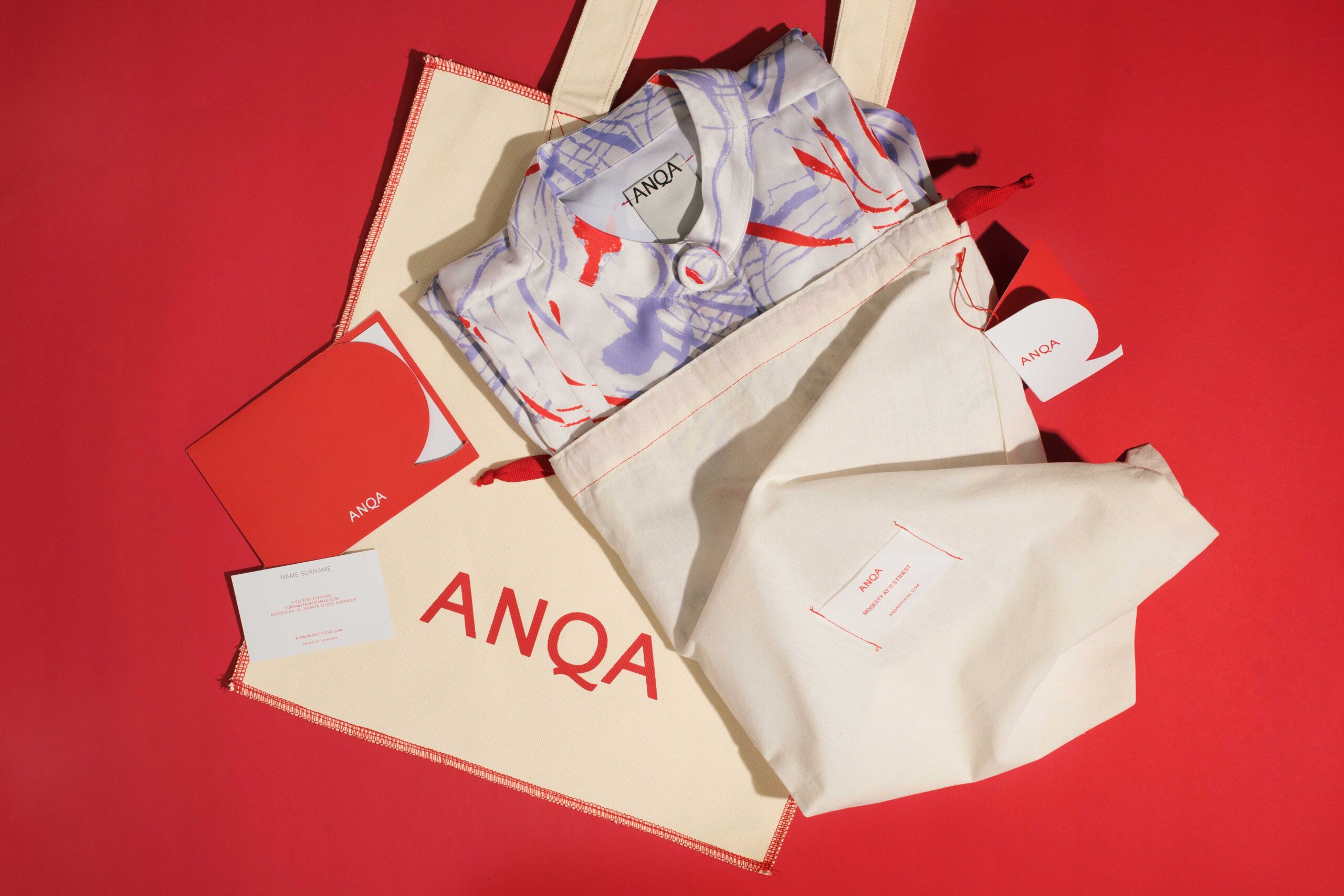
BRAND COLLATERALS
To complement Re Store’s identity, we designed functional and sustainable brand collaterals such as paper bags and hangtags. The hangtags serve a dual purpose: they function as product tags and can also be repurposed as bookmarks. This thoughtful approach highlights the importance of reusability and aligns with Re Store’s focus on sustainability.