Kallé
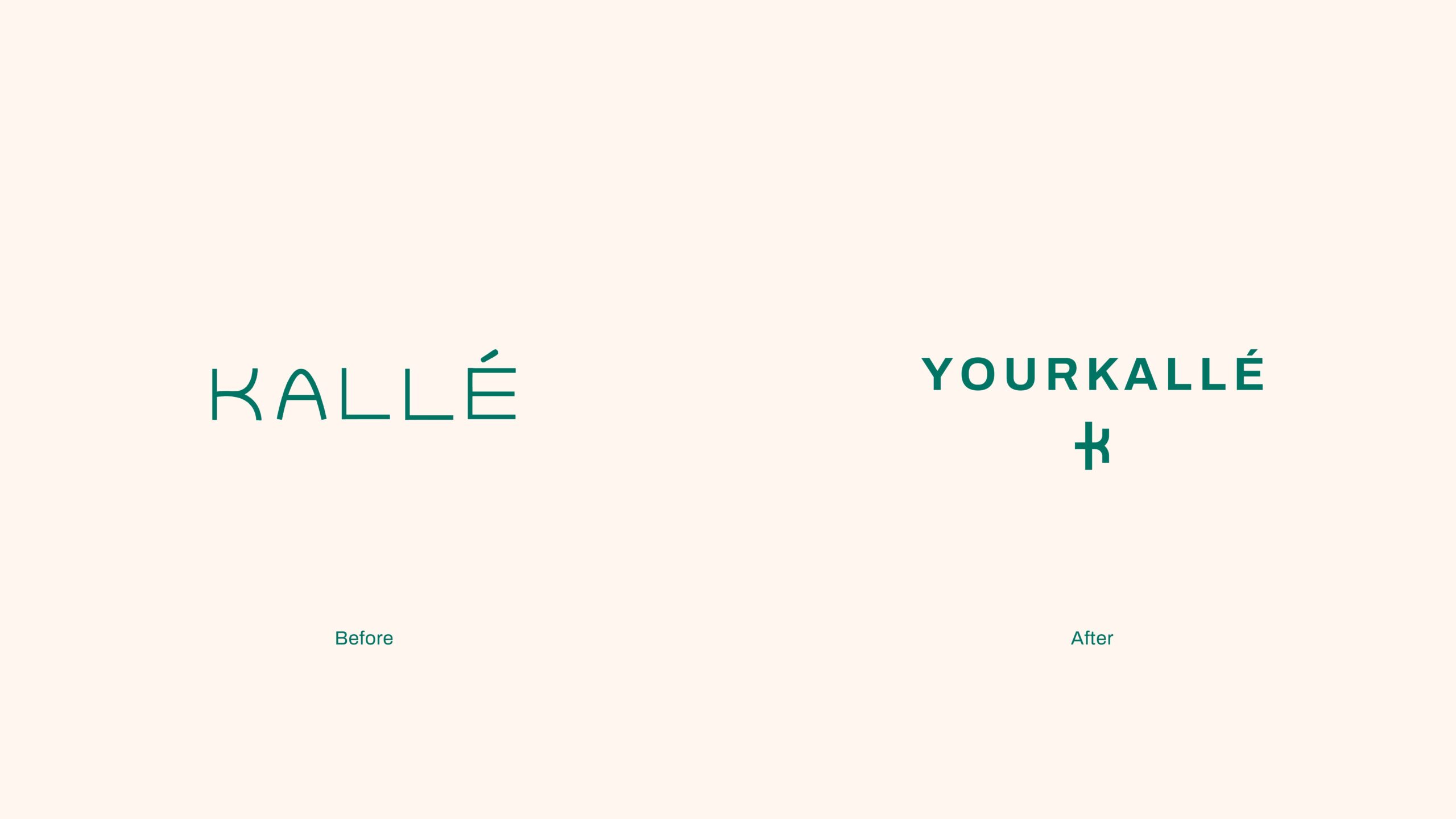
Transforming Kallé to Yourkallé
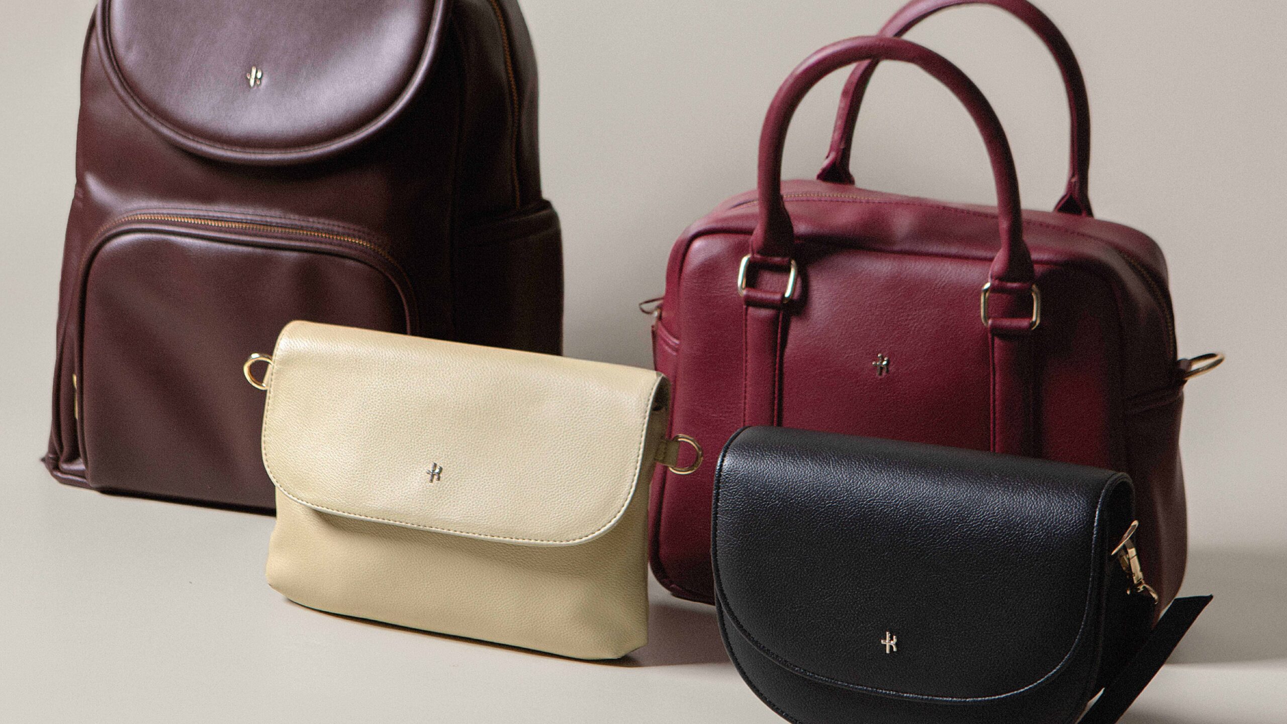
Kallé offers a range of working bags crafted to provide functional solutions and premium-quality products. It embodies the spirit of women’s empowerment in modern society. Since its establishment in 2017, Kallé has earned the admiration of its customers for its convenience, superior quality, and affordability. It has emerged as the preferred choice for Kalléans seeking multifunctional bags while maintaining their style and confidence. Guided by a commitment to attentive listening and drawing inspiration from customer feedback, Kallé continues to innovate, ensuring that it meets the needs of active individuals, regardless of gender.
Scope of Work
Brand Strategy, Brand Identity, Brand Collaterals and Application
Credits
Photographer: Kun Anggeristi
Brand Collaterals and Application, Brand Identity
OUR ROLE
Having gained significant momentum over the years, Kallé has successfully captured the hearts of its customers and fostered a community known as Kalléans, cleverly derived from ‘kalian,’ meaning ‘they’ in Bahasa Indonesia. In 2022, inspired by the loyalty of this community, Kallé transformed, rebranding itself as Yourkallè. This transition aimed to expand the brand’s market reach by embracing diverse customer needs. Yourkallé now caters to a wider audience, introducing tailored designs for men while maintaining its core dedication to empowering women.
This evolution has spurred us to initiate a comprehensive brand strategy project to establish a solid foundation and craft a fresh brand identity. Our goal is to preserve the essence cherished by Kalléans while instilling a sense of familiarity with the original brand.
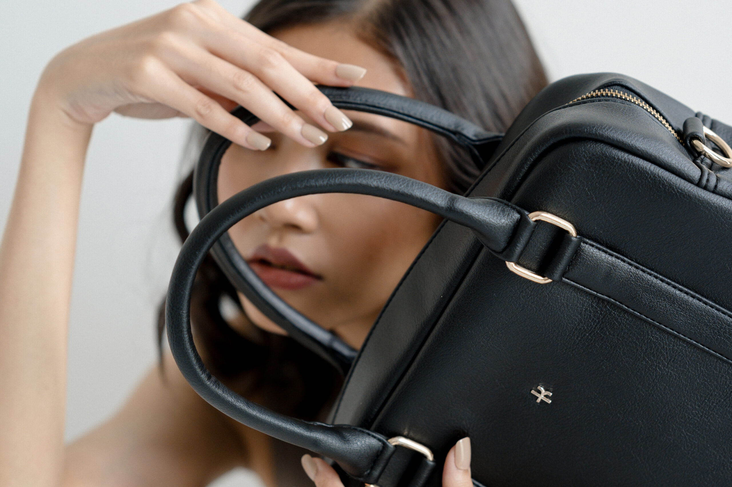
LOGO DESIGN
The redesigned logo reflects the brand’s evolution while retaining a sense of familiarity. Incorporating simplicity and universality, the logo integrates the letters Y and K into a sleek, contemporary design. This fresh visual direction symbolizes Yourkallé’s commitment to timeless design and innovation.
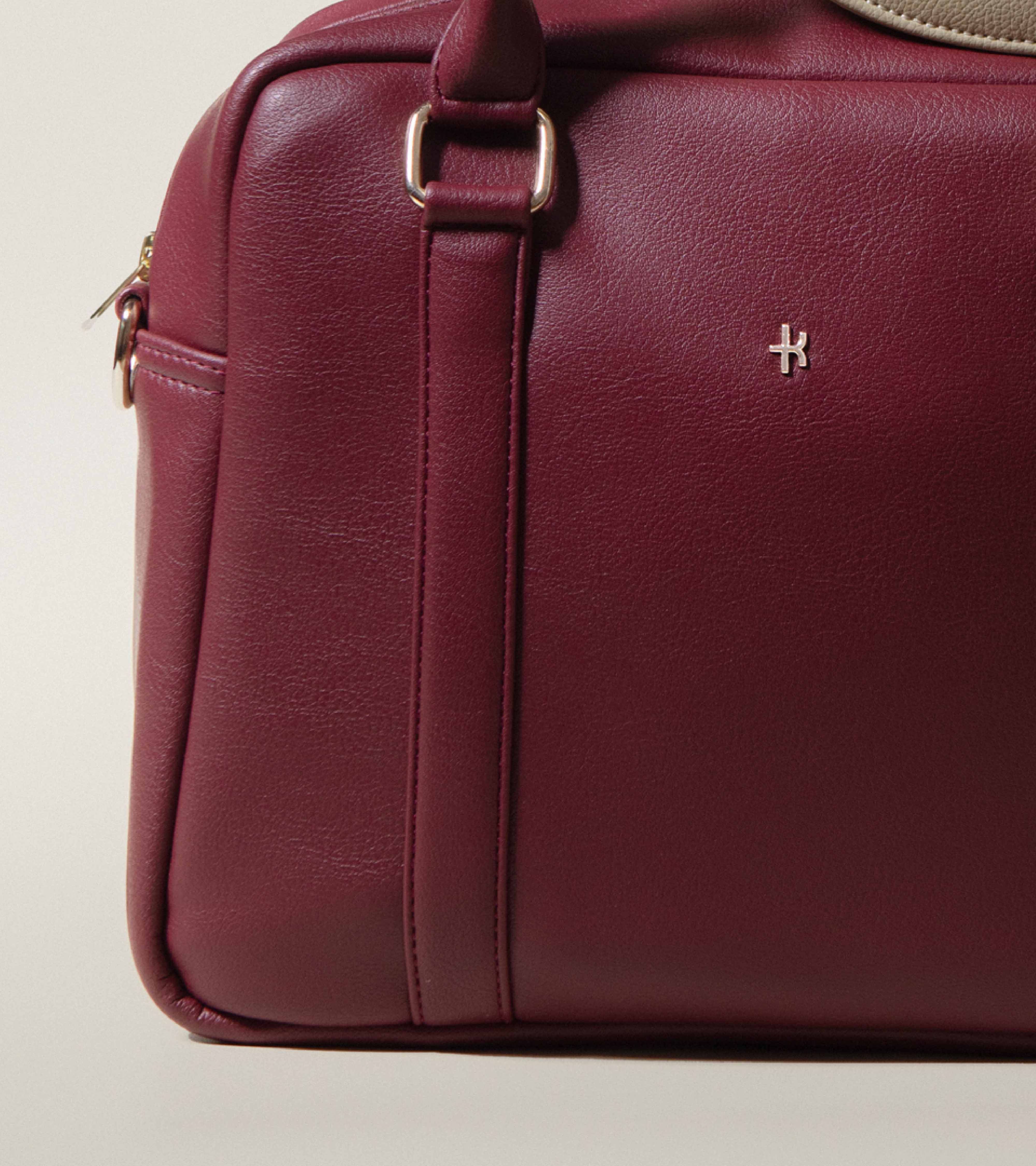
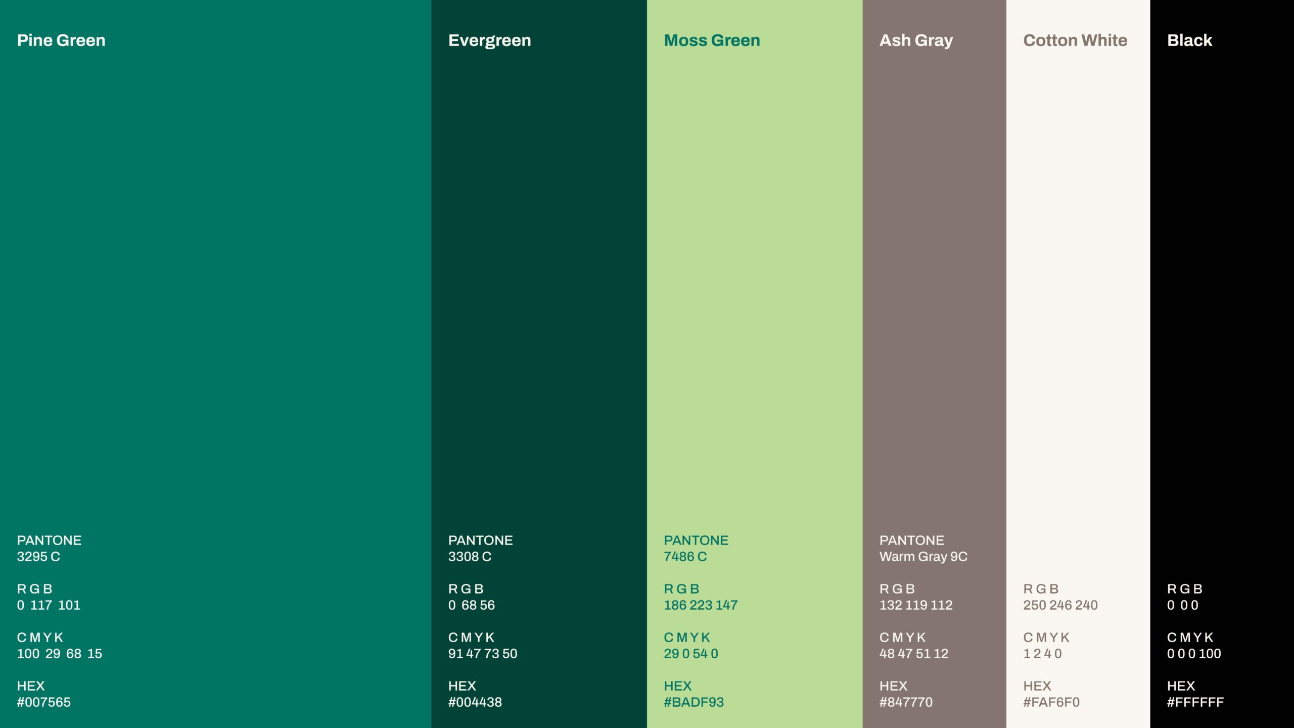
COLORS
Yourkallé’s updated brand identity features its signature iconic green, now enhanced with lighter tones and complementary shades of gray. This combination balances freshness and familiarity, ensuring a seamless transition while infusing renewed energy into the brand.
TYPOGRAPHY
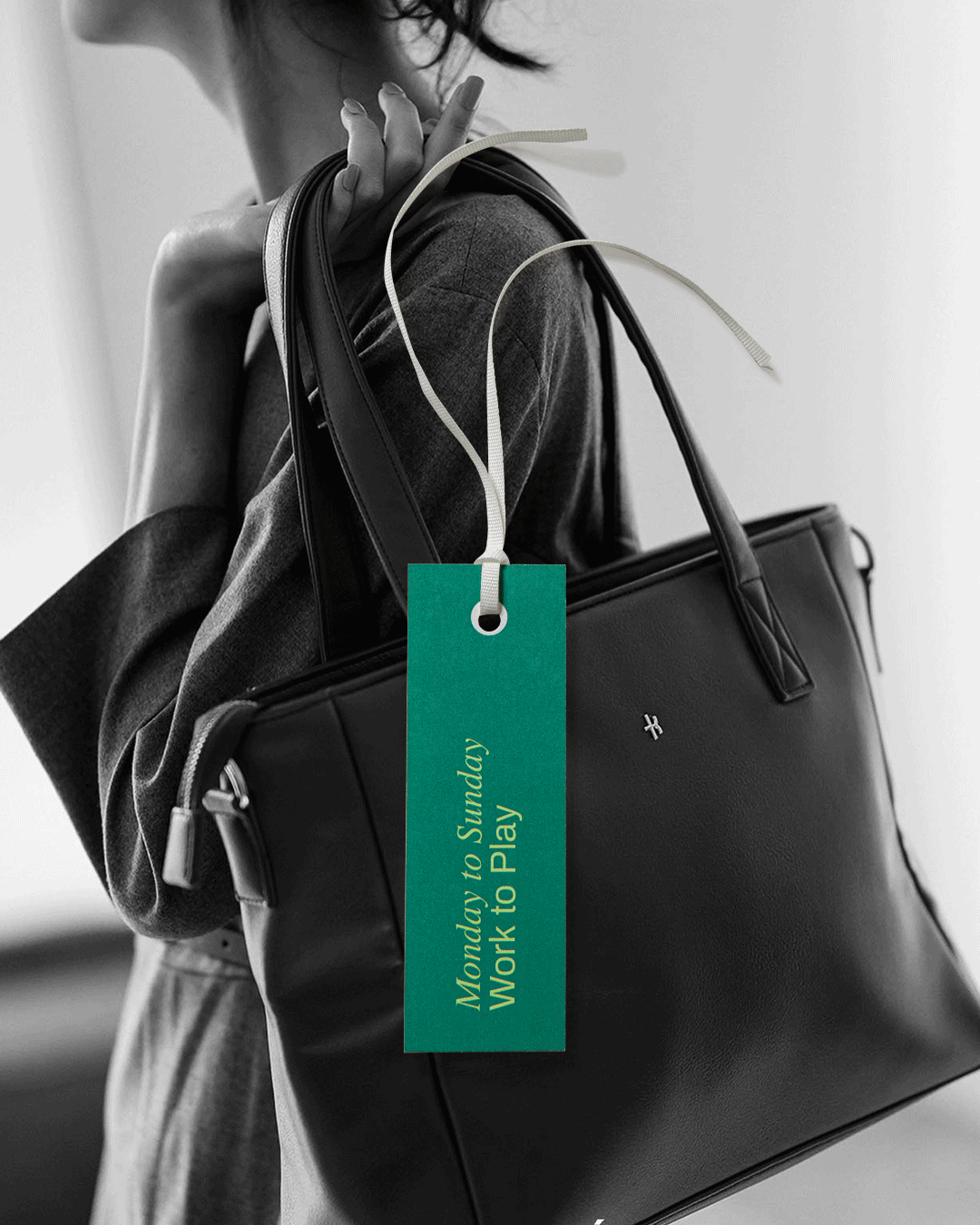
Inspired by the tagline “From Monday to Sunday. Work to Play” Yourkallé’s typography blends the seriousness of Serif fonts with the playfulness of Sans-Serif fonts. This thoughtful combination captures the dynamic essence of the brand, balancing professionalism with a sense of adventure and versatility.